
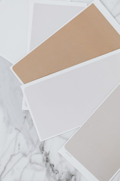
Creating a peaceful and inviting home environment often starts with the colors you choose for your walls and decor. Calm colors can help reduce stress, promote relaxation, and make your space feel welcoming. However, selecting the right calm colors can be challenging if you’re unsure where to begin. In this post, we’ll explore helpful tips to guide you through choosing soothing hues that enhance the tranquility of your home.
Why Choose Calm Colors?
Calm colors tend to be soft, muted, and easy on the eyes. They create an atmosphere that helps you unwind after a busy day. Unlike bold or highly saturated colors, calm tones don’t overwhelm your senses but instead promote balance and serenity. When carefully selected, these colors can make any room feel larger, brighter, and more comfortable.
Popular Calm Color Choices
Before diving into tips, it helps to know which colors are generally considered calm and soothing:
– Soft Blues: Often associated with the sky and ocean, soft blues evoke peace and openness.
– Muted Greens: Inspired by nature, muted greens provide a refreshing and grounding feel.
– Warm Neutrals: Beige, taupe, and warm grays offer a cozy yet neutral backdrop.
– Lavenders and Soft Purples: These shades can feel gentle and calming without being too feminine.
– Pastel Pinks and Peaches: Subtle pinks add warmth and softness to a room.
Tips for Choosing Calm Colors for Your Home
1. Consider the Room’s Purpose
Think about what activities you’ll do in the room. Bedrooms benefit from cool, soft hues like pale blue or lavender to encourage restful sleep. Living rooms can handle slightly warmer neutral tones to create a cozy environment for gathering with family or friends. Bathrooms and reading nooks work well with light greens or gentle blues that evoke cleanliness and calm.
2. Test Colors in Different Lighting
Lighting greatly affects how a color looks. Natural daylight, artificial lighting, and evening light can change paint’s appearance. Always test paint samples on your walls and observe them at different times of the day before making a final decision. This will help you see if the color maintains its calming effect throughout the day.
3. Use the 60-30-10 Rule
To avoid overwhelming your space with too much color, apply the 60-30-10 rule:
– 60% of the room should be your main calm color (like walls or large furniture)
– 30% can be a complementary calm color used on smaller furniture, curtains, or rugs
– 10% is an accent color that adds interest but remains soft and soothing
This balance keeps the room feeling well-coordinated and peaceful.
4. Stick to Muted Tones
Bright or highly saturated colors can be energizing rather than calming. Choose muted versions of your favorite colors by adding gray, white, or beige to soften them. These tones blend easily with other colors and create a harmonious look.
5. Consider Color Psychology
While personal preference is important, understanding basic color psychology can help. For example:
– Blue is linked to calmness and clarity.
– Green promotes balance and renewal.
– Soft neutrals encourage warmth and comfort.
Including colors that psychologically support relaxation can enhance your space’s peacefulness.
6. Coordinate with Existing Elements
If you have furniture, flooring, or artwork you want to keep, choose calm colors that complement these elements. Look for colors within the same tonal family or colors found in your existing decor. This helps create a cohesive and restful environment.
7. Incorporate Texture and Layers
Color alone doesn’t create calmness; texture and layering play a key role. Pair your calm colors with soft fabrics, plush rugs, and natural materials like wood or stone. These textures add depth and comfort without distracting from the soothing color palette.
8. Avoid Too Many Colors
Using too many different colors can disrupt the calming effect. Limit your palette to two or three main calm colors and a few accents. This simplicity helps your space feel organized and tranquil.
9. Don’t Forget the Ceiling and Trim
Walls aren’t the only places for calm colors. Painting ceilings and trim in soft, coordinating shades can enhance the overall peacefulness of the room. A light, cool color on the ceiling can make the space feel airy and open.
10. Get Inspired by Nature
Nature is a great source of calm colors. Look at landscapes, plants, and water elements for inspiration. Bringing these natural tones into your home can create a soothing connection to the outdoors.
Final Thoughts
Choosing calm colors for your home is a wonderful way to create a relaxing retreat where you can recharge and feel comfortable. By considering your room’s purpose, testing colors in different lights, and sticking to muted and natural tones, you can design spaces that promote peace and harmony. Remember, calm colors work best when combined thoughtfully with texture, light, and existing decor elements.
Start with small changes like painting an accent wall or adding soft furnishings in your chosen calm color palette. Over time, you’ll enjoy the soothing atmosphere these colors bring to your everyday living.